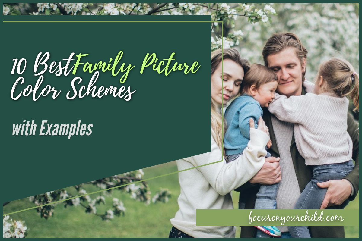
Starting a family is an important milestone for many couples. It is accompanied by many challenges, but the love between parents and their children is enough to keep them going. As such, documenting its growth through family pictures is a popular and touching tradition.
Several factors affect which color scheme is best for your family pictures, such as location, schedule, and skin tone. Below are 10 examples of family picture color schemes you can consider for your own pictorial. A brief introduction to color theory is given, including several types of color schemes and why they work. Lastly, tips regarding family pictures are also enumerated.
Examples of Family Picture Color Schemes
1. Tan, Cream, and Navy
2. Yellow, Gray, and Navy
3. Coral and Navy
4. Muted Yellow and Pink
5. Copper Rust and Veiled Rose
6. Pink with Tan and Cream Accents
7. Monochromatic Earth Tones
8. Red, White, Blue
9. Mustard Yellow and Red
10. Earth Tones and Denim
How to Create Your Own Color Scheme
Having some knowledge regarding color theory will make the creation of color schemes easier. Some colors complement each other, while others will clash and create a harsh image. Moreover, some colors are better used as accents and emphases to other colors. Color theorists have come up with many techniques to efficiently spot aesthetically pleasing color schemes. Colors
Analogous Color Schemes
The analogous color scheme consists of three colors next to each other in the color wheel. You can expand this to have five colors by choosing the colors beside the outside colors. It is common to see one color dominate over the others, with the remaining colors utilized as support and accents.
Analogous color schemes do not have contrast, which results in designs that appear softer and more natural. As a result, these color schemes are perfect for outdoor photoshoots during the spring and autumn seasons.
Complementary Color Schemes
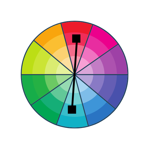
To create a complementary color scheme, simply pick two colors positioned opposite each other in a color wheel. The resulting pair is often a combination of a primary and a secondary color. However, it is best to use one color more predominantly, with the second color functioning as an accent.
This is due to the intense contrast within complementary color schemes. To minimize this effect, you can add tints and hues to the colors to minimize the contrast.
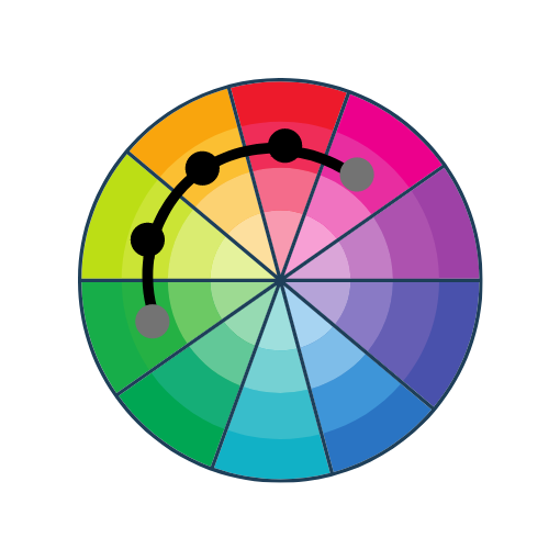
Split-Complementary Color Schemes
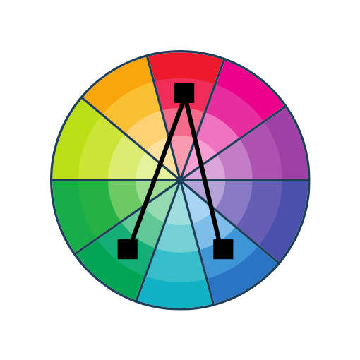
Split-complementary color schemes are a variation of complementary color schemes. To begin, choose a color and then find its complement. Afterward, take the colors adjacent to the complement. Keep in mind that you may need to mess around with tints and shades before striking the perfect balance between the colors.
It has the benefits of a complementary color scheme, including contrast. However, there is less tension between the colors, making it easier to work with. Moreover, split-complementary color schemes are more nuanced and forgiving.
Tetradic Color Schemes
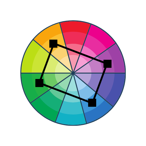
Tetradic color schemes consist of two pairs of complementary colors. These color schemes are also referred to as rectangle color schemes, as the colors, when connected by a line, form a rectangular shape.
Similar to other color schemes, you can optimize the aesthetic value of tetradic color schemes by letting one color dominate over the rest. Regardless, these color schemes are highly versatile and easy to tweak to your preferences.
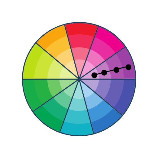
Triadic Color Schemes
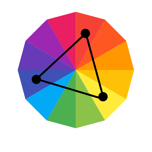
To create a triadic color scheme, choose three colors that have equal distances between each other in a color wheel. In the example above, the colors red, yellow-green, and blue are separated by three other colors each. You can easily determine if a color scheme is triadic if the colors, when connected, form a triangle.
Unedited, triadic color schemes are very vibrant. With that said, letting one color dominate the color scheme will yield the best results. Mellow the other colors by choosing different shades and tints.
Square Color Schemes
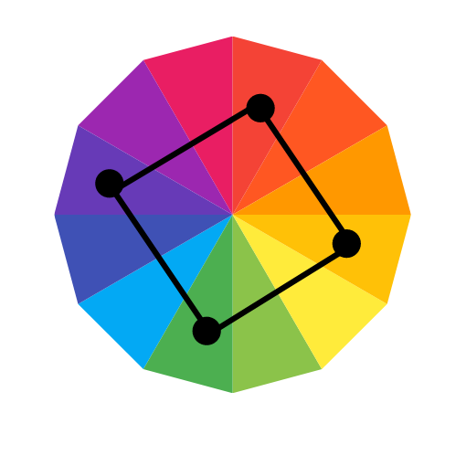
Square color schemes are highly similar to triadic color schemes. Firstly, the colors in this palette are equidistant on a color wheel. However, as opposed to a triadic color scheme’s three or five colors, square color schemes have four. Square color schemes also work best with one dominant color, while the rest provide support and accents.
Monochromatic Color Schemes
Monochromatic color schemes have become more popular over the years because of their elegance and sophistication. To create a monochromatic palette, simply choose one color as the motif. To get the rest of the colors, you can simply experiment with the main color’s shades, tints, and tones. This versatility adds to the color scheme’s overall appeal.
Important Tips for Family Picture Color Schemes

Consider the Location and Schedule of Your Shoot
Before choosing a family picture color scheme, you may want to finalize where your pictorial will take place.
- Indoor photography sessions – You may want to stick to darker color combinations or use black as an accent.
- Outdoor photography sessions – Natural colors and neutral tones work best with outdoor pictorials. You can also add a vibrant color depending on your specific venue.
- Beach pictorial – A combination of white and tan colors is best for family pictures taken on a beach. You may also forgo footwear altogether.
Similarly, you need to keep in mind exactly when your photoshoot will take place; certain color schemes are best suited for spring photoshoots, while others are better for autumn pictorials.
- Spring pictorial – Shades of pink, blue, purple, green, and yellow are perfect for this time of year. Add some earth tones, such as cream or gray, to balance the colors.
- Summer pictorial – Bright and bold colors are excellent choices for summer pictorials. This includes bright red, pink, orange, and blue.
- Fall pictorial – Wearing earth tones and neutral colors will ensure harmony with the scenery. Incorporate browns, yellows, oranges, greens, and purples into your palette.
- Winter and holiday pictorial – Besides the traditional holiday colors of green, red, and white, you can also utilize cream, brown, gray, purple, and blue. You can also coordinate holiday sweaters to make for adorable photos.
Colors to Avoid

While the decision on which colors to include is ultimately up to you, there are some colors you are advised to avoid:
- Neon. The brightness of neon apparel might take away the focus on you and your family. Likewise, the clothes might also reflect on your skin.
- Black. Black as a focal color might darken the image. Likewise, some of the details in your pictures might get shadowed. It is best to use black as an accent or supporting shade. The same is true for any color that is too dark.
- Bright white. Similar to neon, bright white clothing might reflect onto your skin, washing it out. It is also worth noting that in some cases, bright white apparel appears blue in photos.
- Any color that is too bright. You are discouraged from choosing a shade of a color that is too bright. Not only are they difficult to blend with other colors and the background, but they can also be unflattering to your skin.
Avoid Too Many Patterns
If you want to include patterned clothing in your pictorial, make sure that the colors do not clash. Similarly, only use one type of pattern, whether it be polka dots, stripes, and so on. With too many colors and types of patterns, they might be too distracting and aesthetically unpleasant.
In the same vein, avoid clothing with large amounts of logos, texts, and graphic design.
Play with Textures
Instead of having everyone wear cotton or denim, make sure your outfits have variety. Not only will this translate beautifully into images, but this will also allow you to express personality and individuality. Look into wearing chinos, corduroy, lace, velvet, and other types of fabric.
Consider Your Skin Tone

Every person has a different skin tone; your skin tone dictates which colors will flatter your complexion and look best on you.
- If you have a warmer skin undertone, you may want to stick to bright or light colors.
- If you have a cooler skin undertone, blues, browns, grays, greens, and purples will work best for you.
- If you have a neutral skin undertone, bright and vibrant colors will suit you.
Utilize Neutrals and Earth Tones
As evident in the examples of family picture color schemes above, neutrals and earth tones are excellent additions to your palette. They balance colors that are too vibrant, add accents to your outfits, and can even act as a dominant color. Their versatility means that your color scheme can be composed entirely of neutrals and earth tones.
Do Not Go Overboard with Matching
While it might be tempting to have everyone wear the same outfit, there is a chance you and your family will all look the same. If you want to match, it is best to be more subtle about it — try wearing matching accessories, such as bracelets or necklaces.
Where Will Your Portraits Be Placed?
Another consideration to remember is where you will hang your portraits. You do not want your pictures to look out of place in your living room or on your walls. If the decor in your house is monochromatic, it might be best to go with a monochromatic family picture color scheme as well.
However, if you are not too worried about the interior design of your home, feel free to skip this consideration.
Make Sure the Color Schemes Look Good on Everyone
As the famous quote goes, “Family means no one gets left behind.” This goes for all the big things and little things, such as your family picture color scheme. Every member of your family will have different skin undertones and preferences. All of this must be taken into consideration; you may need to compromise and be creative in how you work around these differences.
Let the Kids Dress Comfortably

Whereas adults can bear varying amounts of discomfort from their clothing for a pictorial, children are not good at hiding their feelings. If kids do not like what they are wearing, they will make it known. It is best to dress them in clothes that are well-fitted, not irritating to the skin, and suitable for the weather.
With that said, you may want to bring one or two backup outfits. This gives you a safety net in case they do not like what they are wearing; similarly, if you are having an outdoor photoshoot, there is a chance that the kids’ clothes will get dirty.
Wear What You Like
Even though you can mask your discomfort from what you are wearing, it is still best to wear something that you like. Your happiness and comfort will translate into beautiful, breathtaking photos; your positive attitude will rub off on the rest of your family and even on the professional photographer working with you.
Final Thoughts
Family pictures are a physical manifestation of the love and support that run within a family. Regardless of how you go about with your pictorial, what matters is that this love and support are seen in the resulting images.